macOS is polished and windows is mid
user interfaces should look and feel good no matter the purpose they serve. one of the examples i like to give is macOS - the entire operating system, what the user interacts with looks polished, refined and pleasing to look at and use (i have never used it but im certain it’s a very smooth experience). moving over to windows … well it looks okay at best. i have never been amazed by the aesthetics of the windows 11/10/8, they all look too mid and microsoft have mastered that.
what about linux you ask?
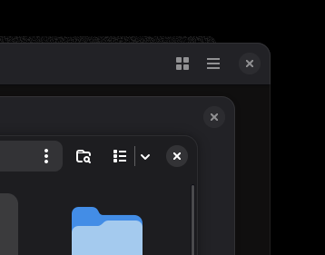
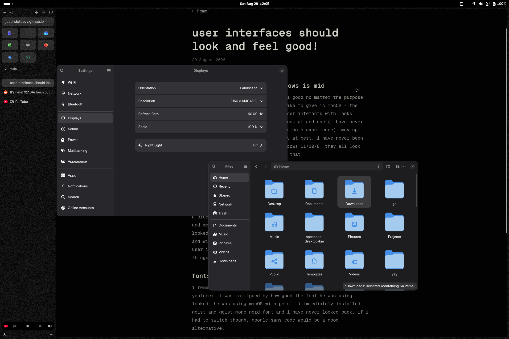
i use arch linux with the gnome desktop environment and it looks amazing to my eye. i have used omarchy before and i liked it but along the way i realized that i do not want to be stuck in a system where everything looks like a terminal interface - i need a proper and normal-looking user interface that feels good to use and most importantly looks good. i have always liked how gnome looked, mostly because it resembles macOS with its rounded look and window decorations. i love it - its a polished and refined user interface for a linux distribution - two of my favourite things.
fonts
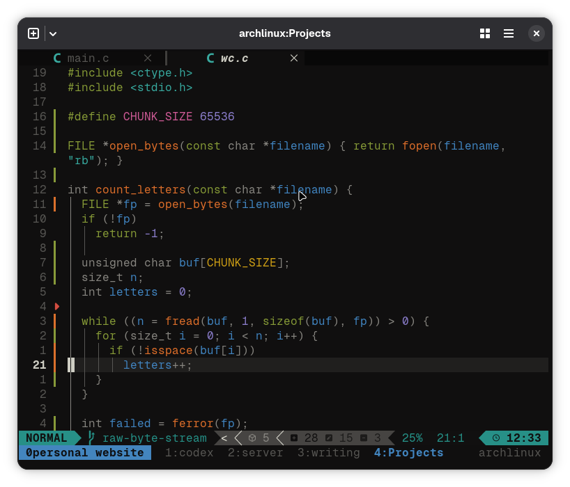
i remember watching a video on youtube of theo - a software dev youtuber. i was intrigued by how good the font he was using looked. he was using macOS with geist by vercel. i immediately installed geist and geist-mono nerd font and i have never looked back. if i had to switch though, google sans code would be a good alternative. btw, this site is using geist-mono and it looks gorgeous!
window decorations :)
i hate hate hate how windows 11/10 window decorations look. it could be because i have a natural dislike towards windows software but its my opinion and i will take it to the grave. it looks boring, bland. there’s nothing interesting going on over there. but macOS (i think im in love with macOS) … they’ve outdone themselves with the traffic lights. and i like how they seemlessly integrate with other apps, even non-apple software. it looks amazing. there’s color, there’s shape there’s something to look at there. gnome window decorations? same with macOS they look stunning and i have no complaints.